01Week 1
Logo
From 2 concepts to polished logo and custom wordmark. Lockup rules were set for when the two appear together and when the mark stands alone.
Food and beverage branding and packaging
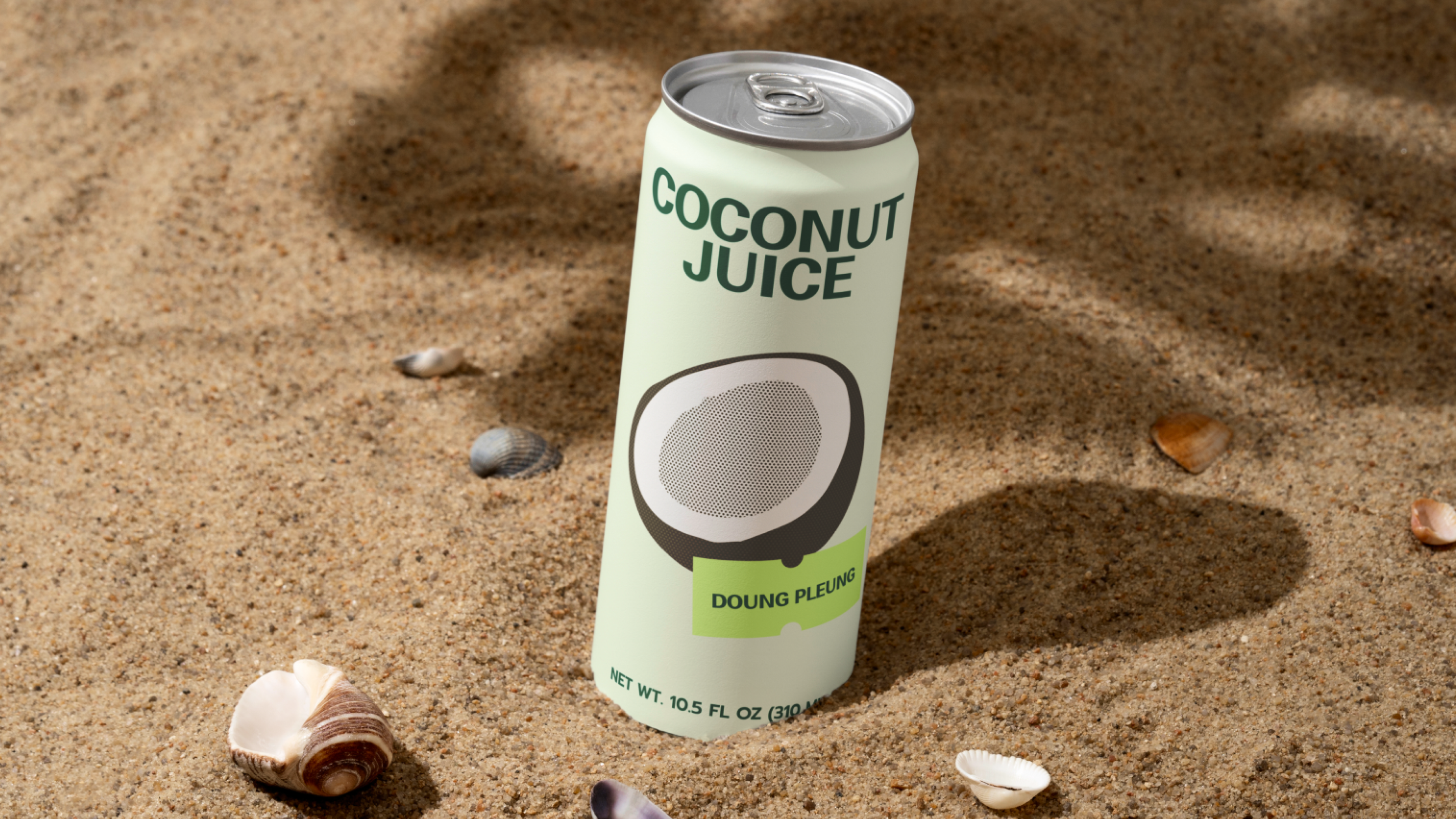
San Valley packs dried fruit and nut snacks in a category where the shelf is loud and the margins are thin. The brief asked for two things that usually pull against each other: packaging that is instantly recognisable and readable at a distance, and a brand that feels premium once the pack is in someone's hand. In a category where competitors shout with saturated colour and cartoon fruit, the premium signal had to come from hierarchy and print quality rather than from volume.
We built the pack around a fixed hierarchy and let colour do the navigation. Every bag carries the same five zones in the same order: brand block at the top, flavour name as the largest element on the pack, a one-line product descriptor beneath it, the net weight and count in a fixed corner, and the regulatory block anchored to a defined panel.
From 2 concepts to polished logo and custom wordmark. Lockup rules were set for when the two appear together and when the mark stands alone.
The five-zone grid was fixed and stress-tested against the longest flavour name, the densest ingredient list and the smallest format. Flavour colours were assigned and checked for distinguishability in sequence on a shelf, including for the most common forms of colour-vision deficiency.
Fourteen SKUs were laid out on the fixed grid across three pouch sizes, the multipack and the crate, with the photographic stills art-directed to one lighting and one crop logic so the range reads as a set rather than a collection of shots.
Colour was proofed on the actual substrate rather than on screen, with drawdowns approved against the palette references and a signed master retained as the production standard. Registration, foil hold and emboss depth were verified on the first article.
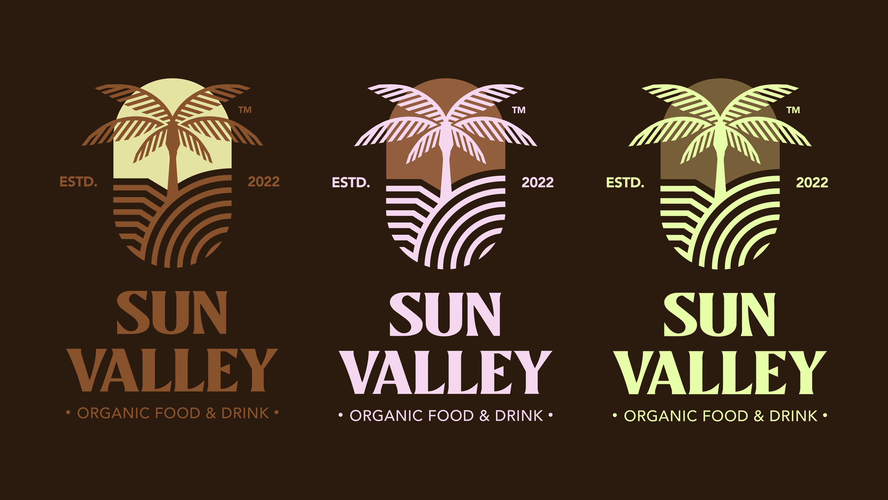
A custom wordmark with a confident, slightly condensed stance, plus a drawn valley mark built from the same stroke logic so it reads as part of the same family. The mark carries the identity where type cannot go crate foil, multipack pattern, app icon, social avatar delivered with clear space, minimum size, one-colour and foil-safe versions, and lockup rules for both states.
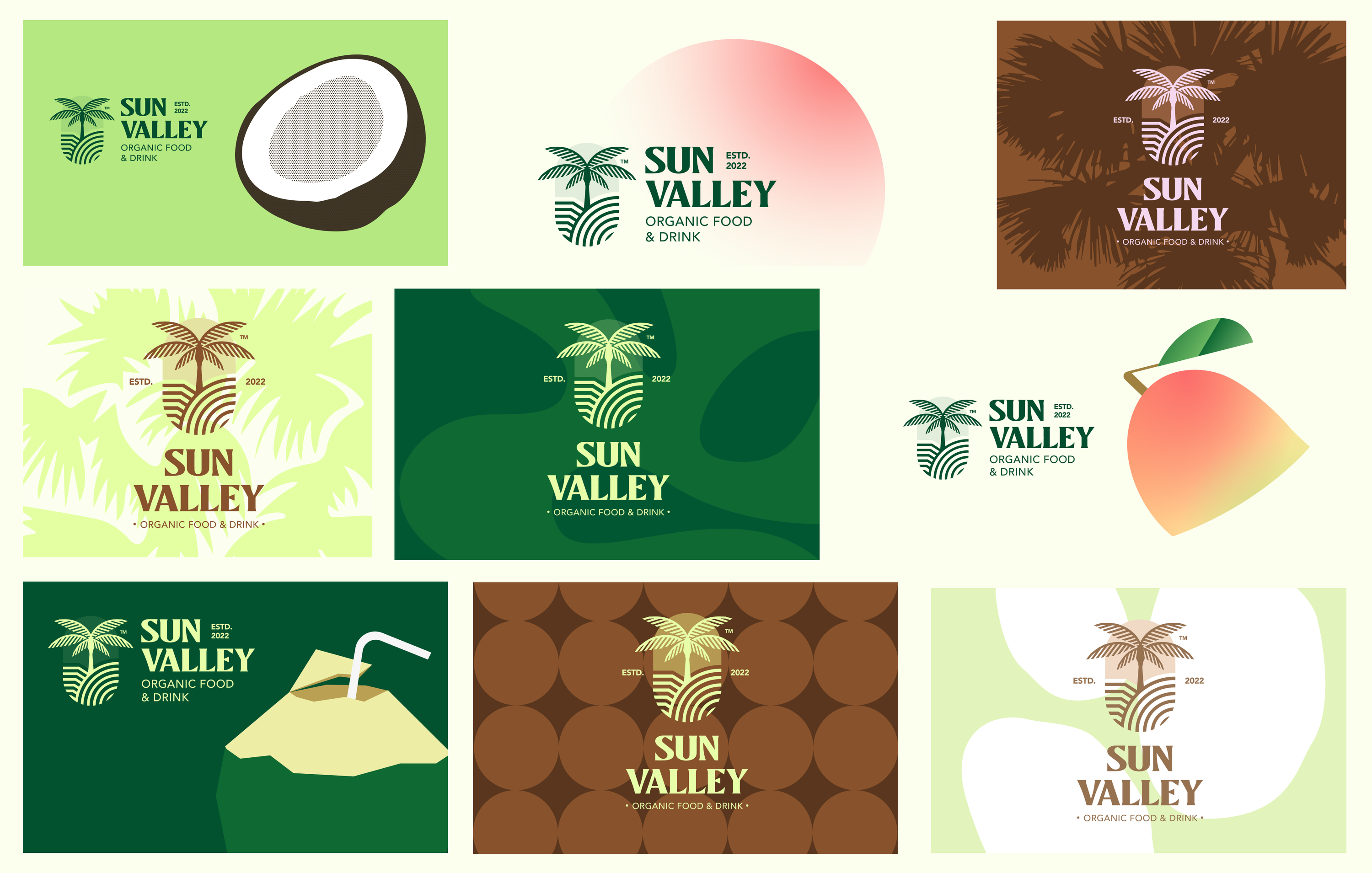
One saturated field per flavour, locked to CMYK and Pantone equivalents with approved drawdowns, checked for sequence distinguishability on shelf and for colour-vision accessibility.
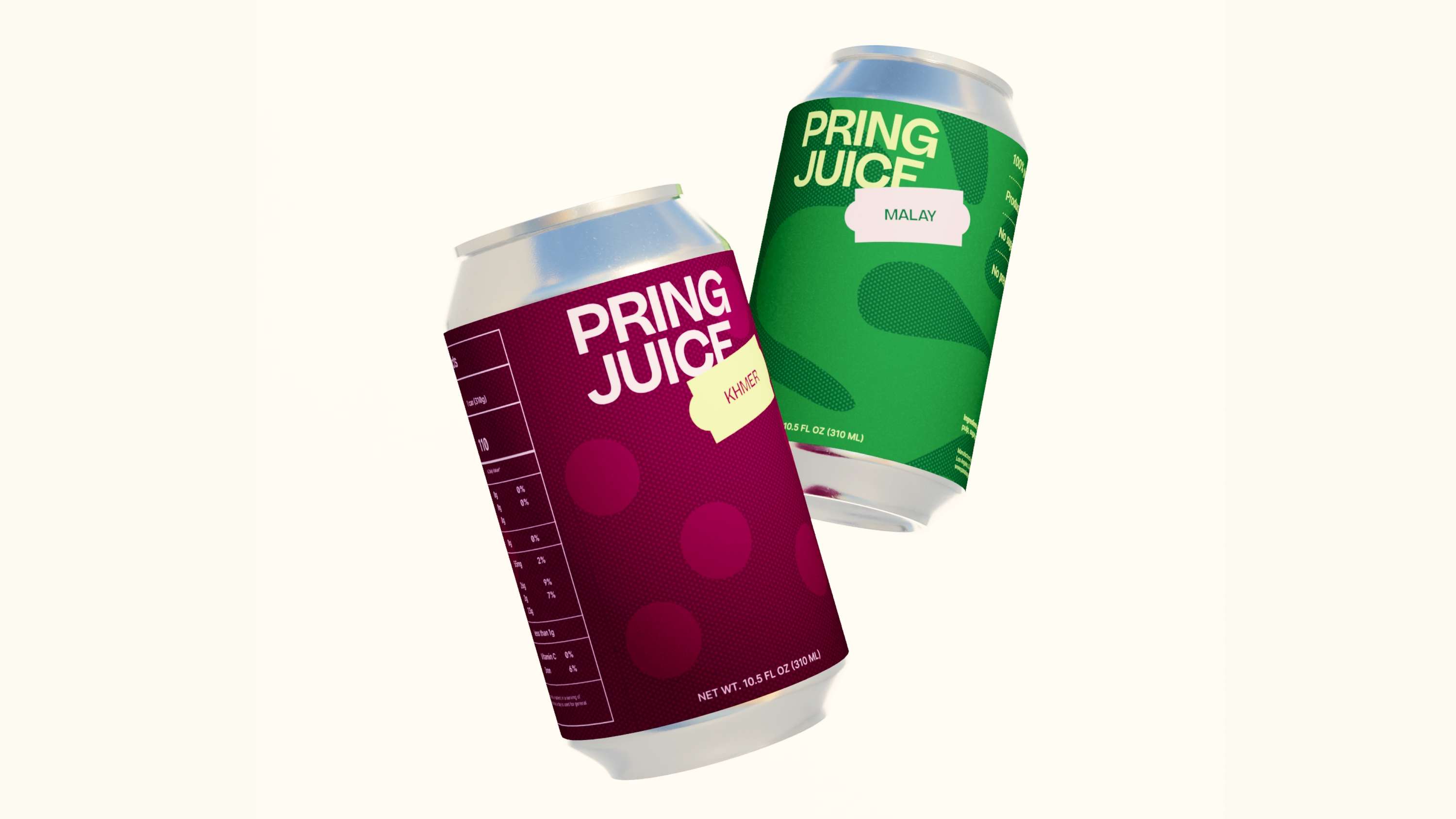
Resealable stand-up pouches in three sizes, a club-store multipack and a variety crate, all built on parameterised dielines so a new flavour is a print run rather than a redesign.
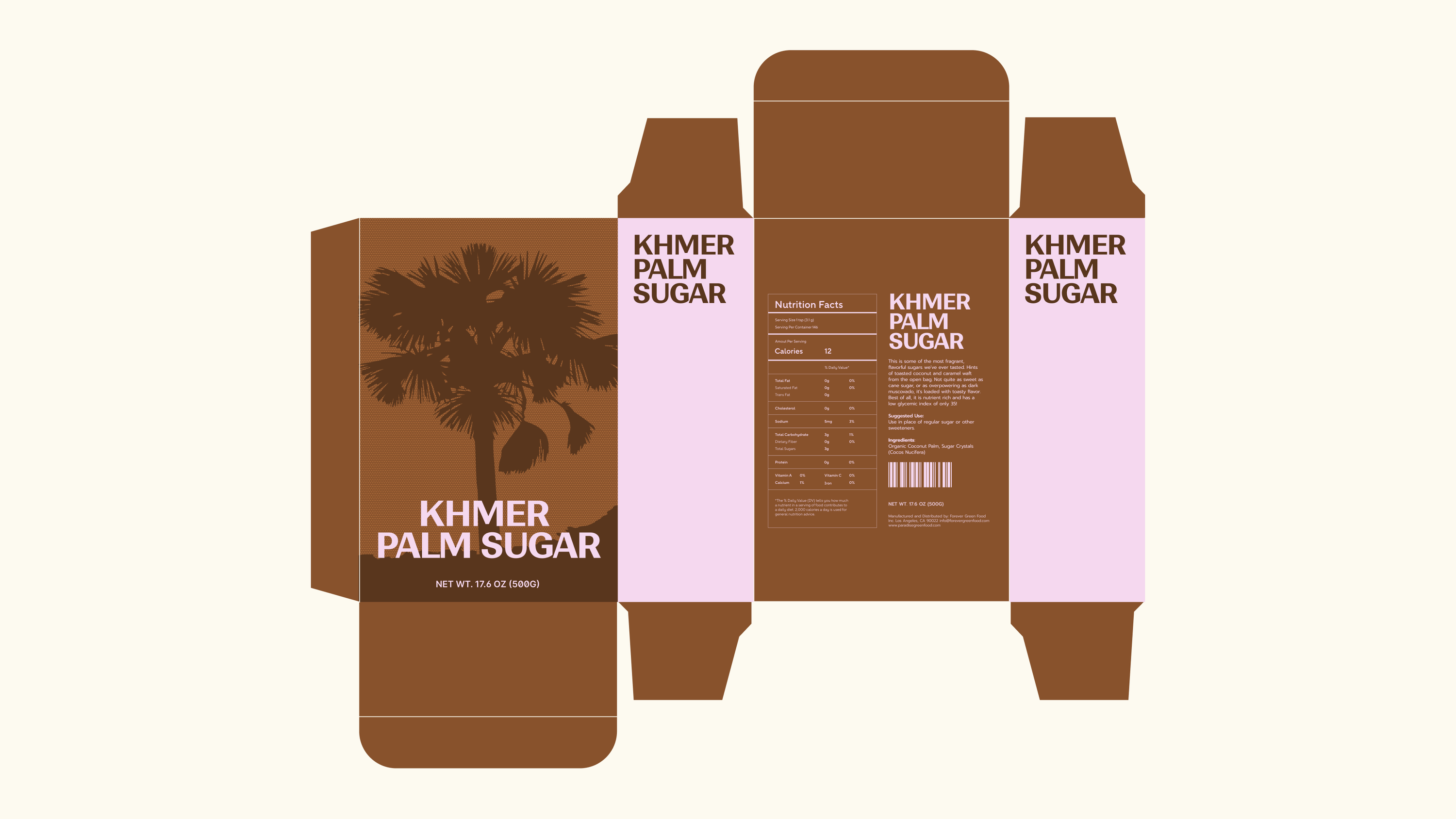
Dielines, CMYK setup, bleed and safe zones, overprint and trapping handled, with nutrition, allergen, net weight and barcode blocks placed in fixed panels and verified against labelling requirements.
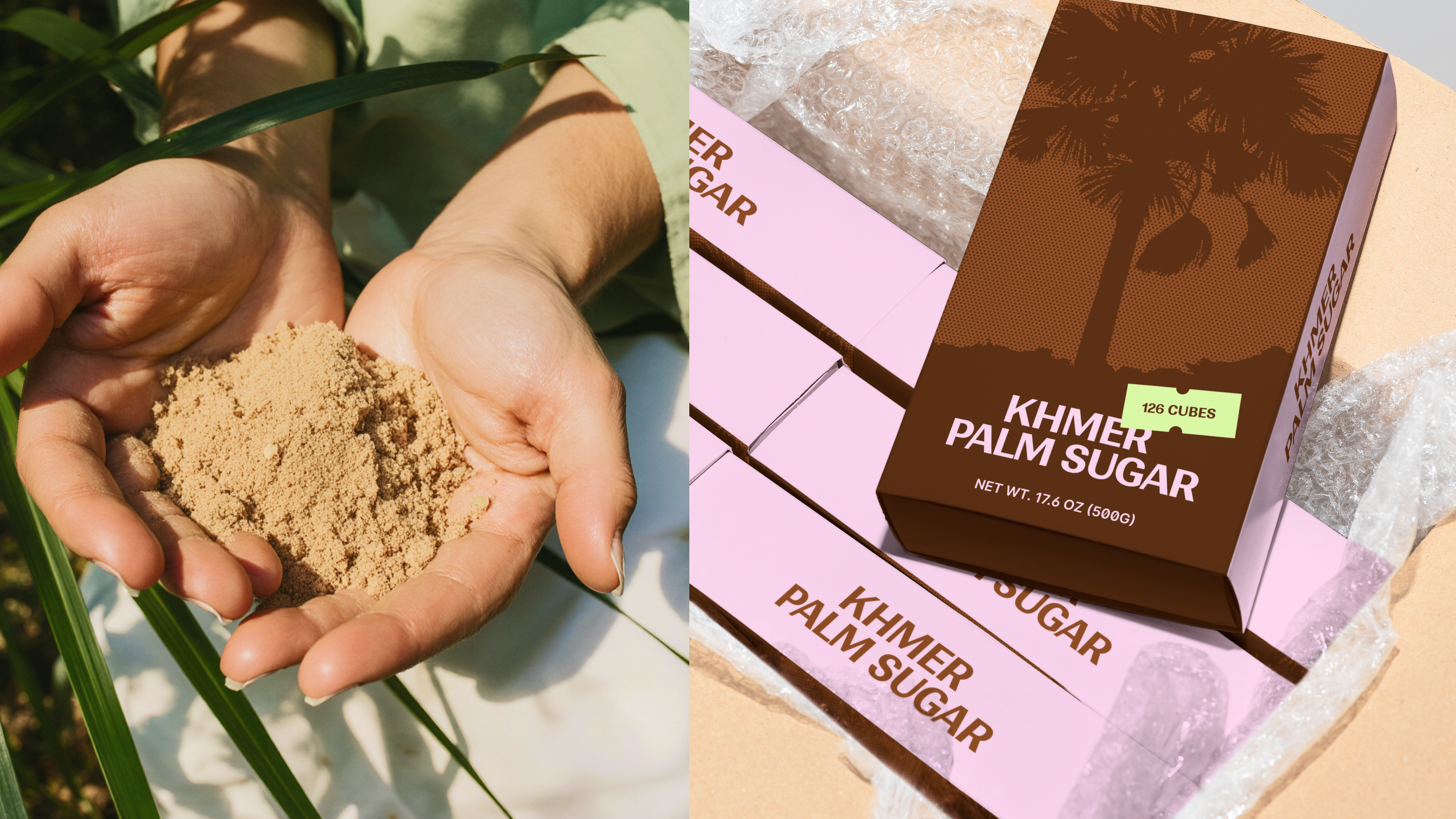
One lighting setup, one crop logic and one surface vocabulary across the range, so pack shots, lifestyle imagery and marketplace thumbnails all come from the same visual world.
Free 30-minute call, a clear estimate within 1 working day, and no obligation after it.
Book a callBrief DX-0412 is with us. Estimate → your inbox in 1 day