top of page
Brewtalism
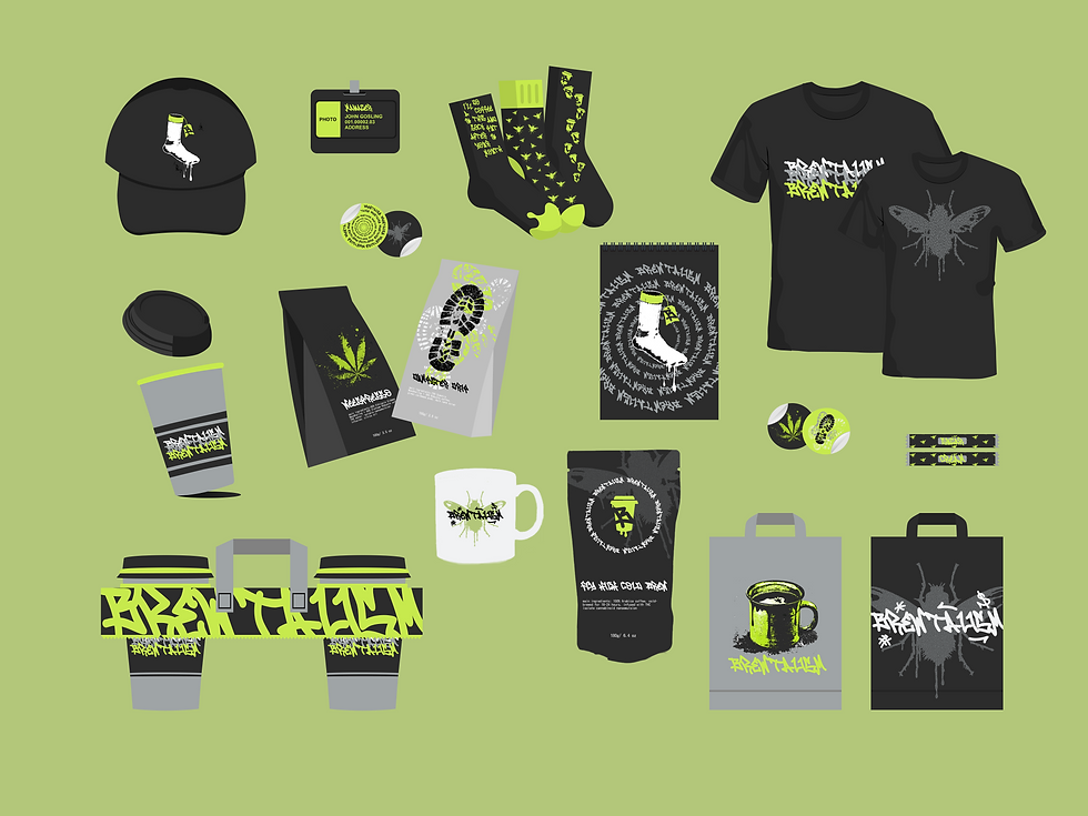
Packaging design for Coffee Shop

Brewtalism is a raw, counter‑culture coffee brand born for urban pop‑ups and indie retail: boozy riffs and merch with a punk attitude. The brand trades polish for punch: brutal coffee blends, unapologetic packaging, and a social presence built for nights, not filters.
We were commissioned to build Brewtalism’s visual and digital identity from the ground up, creating everything from scratch: brand positioning, a unique logo system, a production‑ready packaging ecosystem, and a social toolkit that could scale across retail and on‑premise outlets. The deliverables included:
A distressed primary logo and stamped seal family engineered for clarity at small sizes and across print processes, plus one‑color/spot variants and distressed lockups.
A complete brand system: positioning and voice, color tokens, typographic hierarchy (distress‑grotesk + mono), texture and halftone libraries, iconography, and layout behavior guidelines.
A modular packaging program with 20+ SKU designs and dielines (tshirts, cans, pouches, sachets, cup sleeves), production‑ready print files, sticker/stamp mechanics for in‑shop personalization, and compliance panels for alcohol/THC labeling.
A graphic asset library: vector logos, halftone textures, stamp sheets, hazard panels, sticker templates, and master print specs for suppliers.
A social and launch toolkit: 20 static templates, 10 motion loops, a copy bank with compliance language, UGC frames, and rapid‑drop templates for Instagram/TikTok.
A bold hero landing concept and modular content blocks designed for cinematic impact and easy localization across markets.
The new identity positions Brewtalism as an attitude‑first, production‑ready brand that scales cleanly from in‑shop cups to retail shelves while keeping its brutal voice intact.


bottom of page