
The product page is where a visitor decides. Six things that make people add to cart, with a mobile layout that works and how to test it.
In this article+
People add to cart when the product page answers their questions before they have to ask them. In practice that means photos that show scale and use, the price, variants and delivery time visible without scrolling on mobile, the top objections answered on the page, and reviews next to the button. Design for the person who almost bought.
The page that does the selling
The homepage gets the attention in a redesign. The product page gets the decision. It's where a visitor stops browsing and either commits or leaves, and on most stores it's the page with the most traffic after the homepage.
Shoppers can't touch the product, try it on or ask a salesperson. The page has to do all three.
Six things that make people add to cart
1. Photos that answer questions
Good product photos aren't the prettiest ones; they're the ones that answer what a shopper is wondering. How big is it? What's the texture? What does it look like on a person, in a kitchen, on a desk? Order them: the product clearly first, then scale and use, then detail.
2. Everything needed to decide, above the fold on mobile
On a phone, the first screen should hold the product name, price, the variant selector, delivery time and the add-to-cart button. If any of these needs a scroll, some shoppers will never see it.
3. Variants you can see
Swatches beat dropdowns. Size guides open in place, not in a new tab. Out-of-stock variants are marked before someone taps them, with a way to be notified.
4. Objections answered on the page
Read your support inbox. The three questions people ask most — usually sizing, ingredients or materials, delivery and returns — belong on the product page, not in an FAQ nobody opens.
5. Proof next to the button
A star rating and review count beside the price, a handful of reviews below, and photos from real customers if you have them. Trust works best at the moment of decision.
6. One clear button
One primary action, visually louder than everything else on the page. Express checkout options can sit underneath; a dozen competing badges and banners can't.
A mobile layout that works
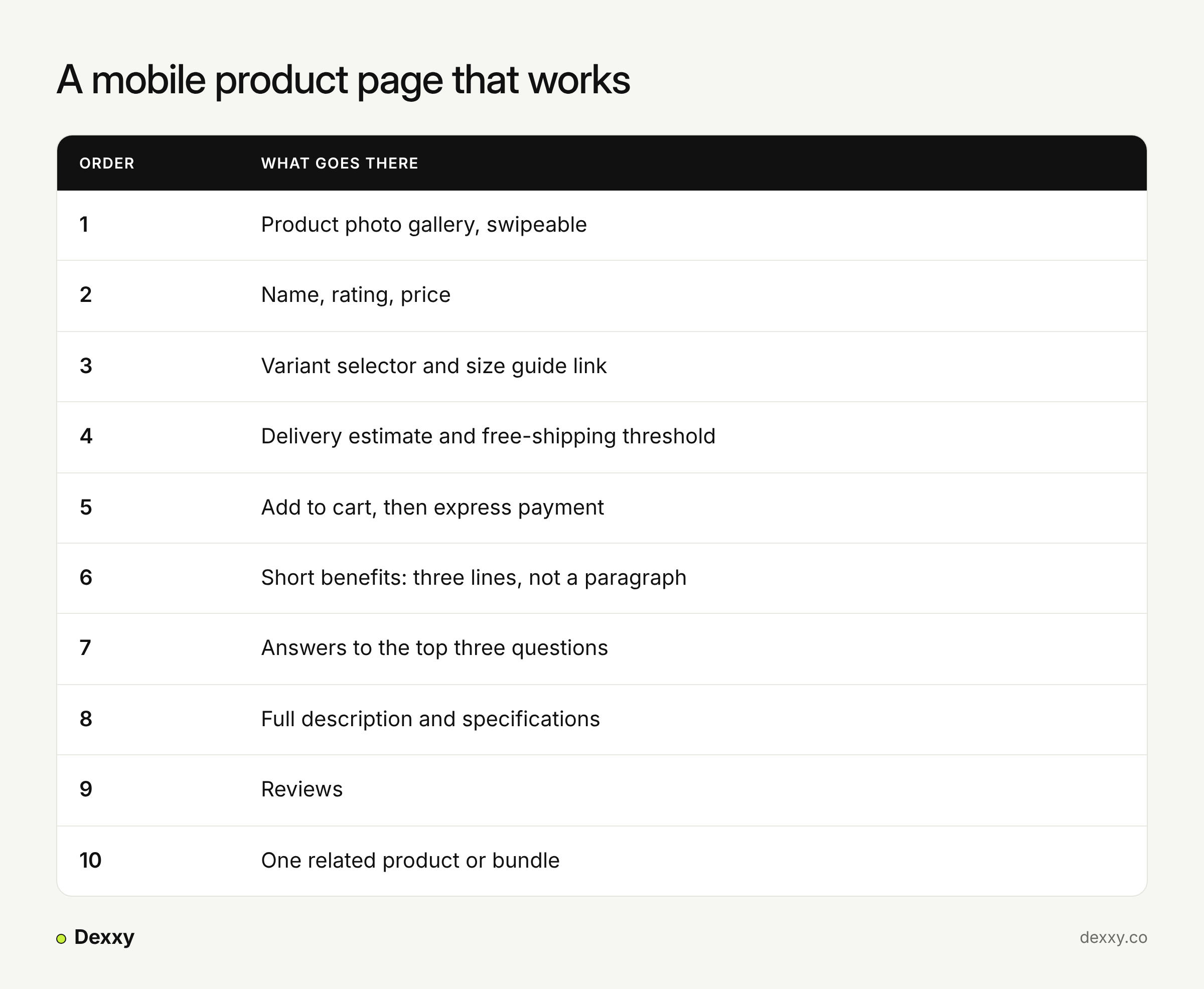
Two product pages we redesigned
A California sportswear brand. The old store ran on a template. The new product page was built for editorial presentation and easy decisions: imagery that carries the brand's attitude, clear sizing and variant selection, and status tags for new, trending and sale items. Sold-out pieces stay visible with an email sign-up in place of the buy button, so interest turns into a lead instead of a dead end. A "you may also like" row appears on the product page and again in the cart. Within three months of launch, mobile conversion rose 2.13 times and bounce rate fell from 65.5% to 24%. The product page was one part of that; navigation, filters, sorting and the cart were redesigned too.
A chef-led chocolate atelier. The product was couture, but the old store showed it as a grid of ingredients. On the new product pages, each bonbon is connected to the French pastry that inspired it, so the story justifies the price before anyone asks. Together with a smart cart drawer and a clearer purchase path, average order value rose 38% in the 90 days after launch.
How to test your own product page
Open it on your phone, on mobile data, one-handed.
Without scrolling, can you see price, variants, delivery time and the button?
Can you find the answer to your top support question in under ten seconds?
Check the product page to add-to-cart rate in your analytics, by device.
Change one thing, then measure for at least two to four weeks.
FAQ
Should product descriptions be long or short? Both: three short benefit lines near the button for people deciding fast, and full detail further down for people who need it.
Do product videos help conversion? They help when they show something photos can't — how a product moves, fits or is used. A brand film on a product page usually doesn't.
How many product images should a page have? Enough to answer the shopper's questions; for most products that's five to eight, including at least one that shows scale.
Next step
Send us one product page and we'll tell you what we'd change first. Start a brief →